The Gallery Gallery Pro Component can be used to quickly create a responsive and stylish image gallery on your site. Select various layouts like Basic Grid, Masonry Grid or Slideshow with thumbnails.
Basics Settings
- Date Publishing Settings
- Set the Start Publishing and Finish Publishing dates. This will cause the ui/Theme-Builder component to only be published for the specified time period. If you use both the Start Publishing and the Finish Publishing, the ui/Theme-Builder component will show up only between the beginning date and the ending date.
- Start Publishing
- If you only set the Start Publishing and not the Finish Publishing, Joomla! will begin displaying the ui/Theme-Builder component on the beginning publishing date given but it will never stop showing the component.
- Finish Publishing
- If you only set the Finish Publishing and not the Start Publishing, Joomla! will show the ui/Theme-Builder component as soon as you have turned it on and will stop showing the component once the ending publishing date has been reached.
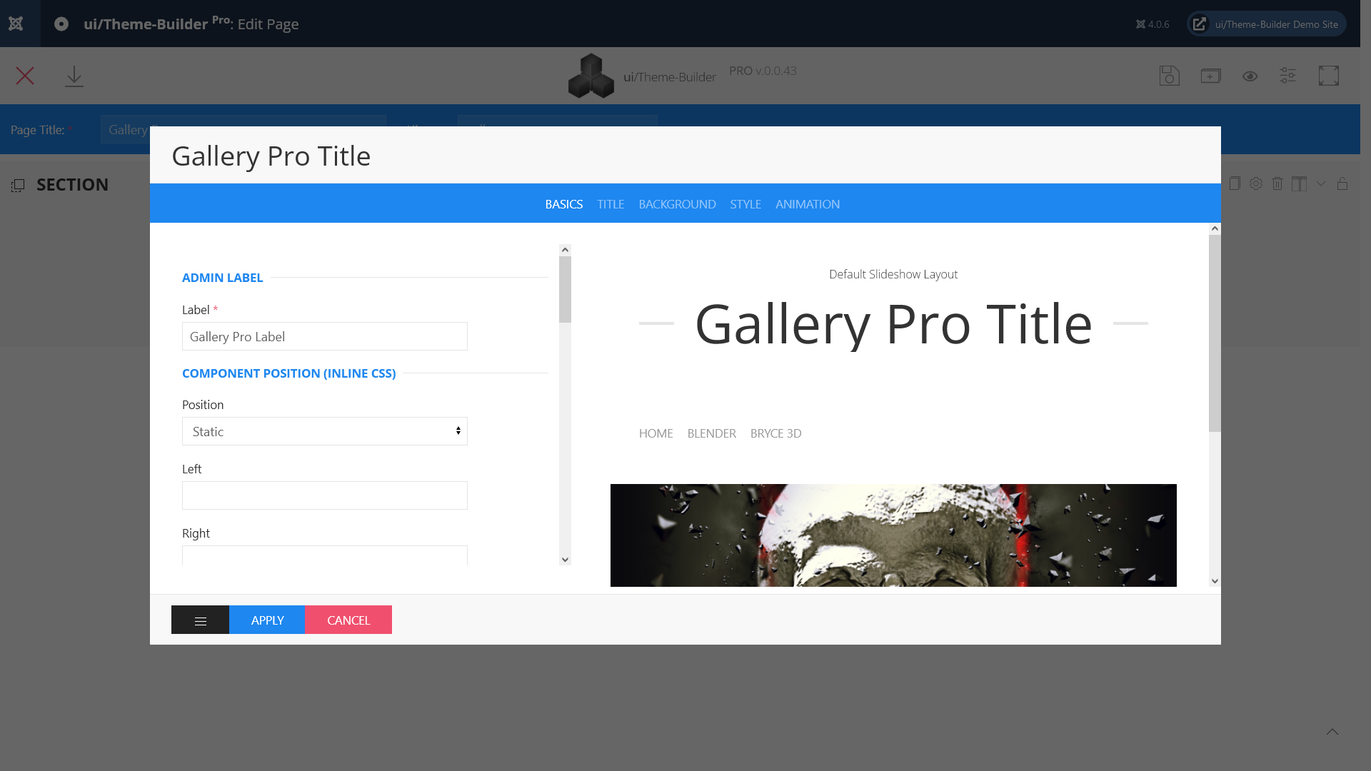
- Label
- Define a name to easily identify this element inside the Theme-Builder.
- Position
- Position the component in the normal content flow but with an offset relative to itself.
- Left
- If position: relative; - the left property sets the left edge of an element to a unit to the left/right of its normal position.
If position: absolute; - the left property sets the left edge of an element to a unit to the left of the left edge of its nearest positioned ancestor. (e.g. 20% or 50px ...) - Right
- If position: relative; - the right property sets the right edge of an element to a unit to the left/right of its normal position.
If position: absolute; - the right property sets the right edge of an element to a unit to the right of the right edge of its nearest positioned ancestor. (e.g. -20% or 50px ...) - Top
- If position: relative; - the top property makes the element's top edge to move above/below its normal position.
If position: absolute; - the top property sets the top edge of an element to a unit above/below the top edge of its nearest positioned ancestor. (e.g. -20% or 50px ...) - Bottom
- If position: relative; - the bottom property makes the element's bottom edge to move above/below its normal position.
If position: absolute; - the bottom property sets the bottom edge of an element to a unit above/below the bottom edge of its nearest positioned ancestor. (e.g. 10% or 50px ...) - z-index
- The z-index property specifies the stack order of an element. Z-index only works on positioned elements (position: absolute, position: relative).
- Show
- Select one of the following options to show the element for screens larger than the specified width.
- Hidden
- Select one of the following options to hide the element from screens larger than a specified width.
- Gallery Folder *
- The Gallery folder that contains all of your existing albums/categories and photos. Default full path is 'JOOMLA_ROOT/media/com_uithemebuilderpro/galleries'. You can only change the folder, not the directory path. (Learn more)
- Gallery Thumbnail Folder *
- Thumbnail Folder where your thumbnails and resized full photos are placed. Default full path is 'JOOMLA_ROOT/images/galleries-thumbnails'.
- Image Quality *
- Quality used for generated JPEG files (both thumb and previewsize)
- Thumbnail Size *
- Maximum size of the shortest photo side for thumbnails
- Preview Size *
- Maximum size of the longest photo side for full size photos displayed
- Square Thumbnails?
- Yes or No.
- Class
- Define one or more class names for the element. Separate multiple classes with spaces.
- ID
- ID Selector for the element.
- Use Microdata?
- Yes or No. (Learn more)
Title Settings
- Title Show
- When set to 'Yes', this option will enable component title in front-end.
- Title
- Enter text which will be used as Component title.
- Title HTML Tag
- Choose a HTML-Tag for the title.
- Font Size
- Set Title font size for this selector.
- Font Weight
- Set Title font weight for this selector.
- Title Style
- Choose a title style modifier.
- Title Color
- Choose a Title color.
- Subtitle Show?
- Yes or No.
- ...
- ...
Background Settings
- Custom Background
- When set to 'Yes', you can set different background options. (Background images, different Blendmodes, Custom color)
When set to 'SVG', you can use your own SVG backgrounds. (Learn more) - Module Background
- Choose a default background color.
- Inverse Color
- Select the 'light' class to improve the visibility of objects on dark backgrounds in a light style. When using a dark style, add the 'dark' class to elements on a light background.
The 'Primary' and 'Secondary' (Background Settings) option are extending the inverse style from the Inverse component automatically. If you want to prevent this behavior, for example because you are using cards in these sections, add this 'Preserve color' option.
Style Settings
- Addon Padding
- Choose a padding for the component.
- Set Home link
- The Title of our Home-Link.
- Choose a Layout
- You can choose between "Grid", "FlexBox", "Slideshow" or "Full" layout.
- Choose Download Options
- You can choose between "No", "Public" or "Registered". Select "Registered" and set "Download original File?" to "No", the script will create an image file with a scale factor of "1.1".
- Download original File?
- Yes or No.
- Slider Autoplay? (Slideshow Layout)
- Yes or No.
- Autoplay Interval (Slideshow Layout)
- Set the interval in milliseconds between switching slides.
- Show Slider Navigation? (Slideshow Layout)
- Yes or No.
- Show Slider Dotnav? (Slideshow Layout)
- Yes or No.
- Show Thumbnail Nav? (Slideshow Layout)
- Yes or No.
- Show Thumbnail Nav outside the slideshow? (Slideshow Layout)
- Yes or No.
- Masonry Grid (Grid Layout)
- If grid cells have different heights, a layout free of gaps can be created by choose 'Yes'.
- Grid: Match height(Grid Layout)
- Choose 'Yes' to match the height of the direct child of each cell.
- Tablet Grid Settings(Grid Layout)
- Select a Element Width for Tablets
- Desktop Grid Settings(Grid Layout)
- Select a Element Width for Desktop
- TV's Grid Settings(Grid Layout)
- Select a Element Width for TV's
- Grid Gutter(Grid Layout)
- The Grid component comes with a default gutter that is decreased automatically from a certain breakpoint usually on a smaller desktop viewport width.
- Grid Cover? (Grid Layout)
- Yes or No.
Animation Settings
- Scrollspy Animation
- The Scrollspy component listens to page scrolling and triggers events based on the scroll position. For example, if you scroll down a page and an element appears in the viewport for the first time, you can trigger a smooth animation to fade in the element.
- Background Image Parallax?
- Yes or No.
")