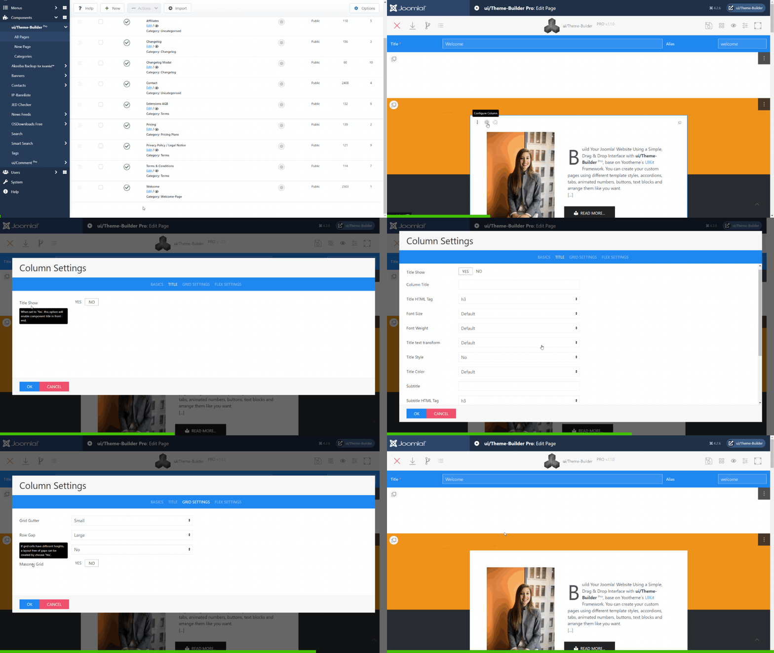
How to create, edit, & style columns. Columns can be manipulated and styled either via the Column handle icon.
Basics Settings
- ID
- Define one or more id names for the column.
- Class
- Define one or more class names for the column. Separate multiple classes with spaces.
Title/Subtitle Settings
- Title Show
- When set to 'Yes', this option will enable Title and or Subtitle in front-end.
- Section Title
- Enter text which will display as a column title.
- Title HTML Tag
- Choose a HTML-Tag for the title.
- Font Size
- Set Title font size for this selector.
- Font Weight
- Set Title font weight for this selector.
- Title Style
- Choose a title style modifier.
- Title Color
- Choose a Title color.
- Subtitle
- Insert text which will display as a column subtitle (short description).
- Subtitle HTML Tag
- Choose a HTML-Tag for the subtitle.
- Subtitle Font Size
- Set Subtitle font size for this selector.
- Subtitle Style
- Choose a subtitle style modifier.
- Subtitle Weight
- Set subtitle font weight for this selector.
- Heading Alignment
- Choose a type of text alignment for title and subtitle.
Background Settings
- Custom Background
- When set to 'Yes', you can set different background options. (Background color, Shapes).
- Background
- Choose a default background option.
- Inverse Color
- Select the 'light' class to improve the visibility of objects on dark backgrounds in a light style. When using a dark style, add the 'dark' class to elements on a light background.
The 'Primary' and 'Secondary' (Background Settings) option are extending the inverse style from the Inverse component automatically. If you want to prevent this behavior, for example because you are using cards in these sections, add this 'Preserve color' option.
Grid Settings
- Grid Gutter
- The Grid component comes with a default gutter that is decreased automatically from a certain breakpoint usually on a smaller desktop viewport width.
- Grid Divider
- Choose 'Yes' to separate grid cells with lines. This option can be combined with the gutter modifiers. As soon as the grid stacks, the divider lines will become horizontal.
- Masonry Grid
- Yes or No. If grid cells have different heights, a layout free of gaps can be created by choose 'Yes'. (Learn more)
Flex Settings
- Vertical alignment
- These options define the vertical alignment of flex items.

