Create a responsive lightbox gallery with images ( #ToDo or videos).
Basics Settings
- Date Publishing Settings
- Set the Start Publishing and Finish Publishing dates. This will cause the ui/Theme-Builder component to only be published for the specified time period. If you use both the Start Publishing and the Finish Publishing, the ui/Theme-Builder component will show up only between the beginning date and the ending date.
- Start Publishing
- If you only set the Start Publishing and not the Finish Publishing, Joomla! will begin displaying the ui/Theme-Builder component on the beginning publishing date given but it will never stop showing the component.
- Finish Publishing
- If you only set the Finish Publishing and not the Start Publishing, Joomla! will show the ui/Theme-Builder component as soon as you have turned it on and will stop showing the component once the ending publishing date has been reached.
- Label
- Define a name to easily identify this element inside the Theme-Builder.
- Position
- Position the component in the normal content flow but with an offset relative to itself.
- Left
- If position: relative; - the left property sets the left edge of an element to a unit to the left/right of its normal position.
If position: absolute; - the left property sets the left edge of an element to a unit to the left of the left edge of its nearest positioned ancestor. (e.g. 20% or 50px ...) - Right
- If position: relative; - the right property sets the right edge of an element to a unit to the left/right of its normal position.
If position: absolute; - the right property sets the right edge of an element to a unit to the right of the right edge of its nearest positioned ancestor. (e.g. -20% or 50px ...) - Top
- If position: relative; - the top property makes the element's top edge to move above/below its normal position.
If position: absolute; - the top property sets the top edge of an element to a unit above/below the top edge of its nearest positioned ancestor. (e.g. -20% or 50px ...) - Bottom
- If position: relative; - the bottom property makes the element's bottom edge to move above/below its normal position.
If position: absolute; - the bottom property sets the bottom edge of an element to a unit above/below the bottom edge of its nearest positioned ancestor. (e.g. 10% or 50px ...) - z-index
- The z-index property specifies the stack order of an element. Z-index only works on positioned elements (position: absolute, position: relative).
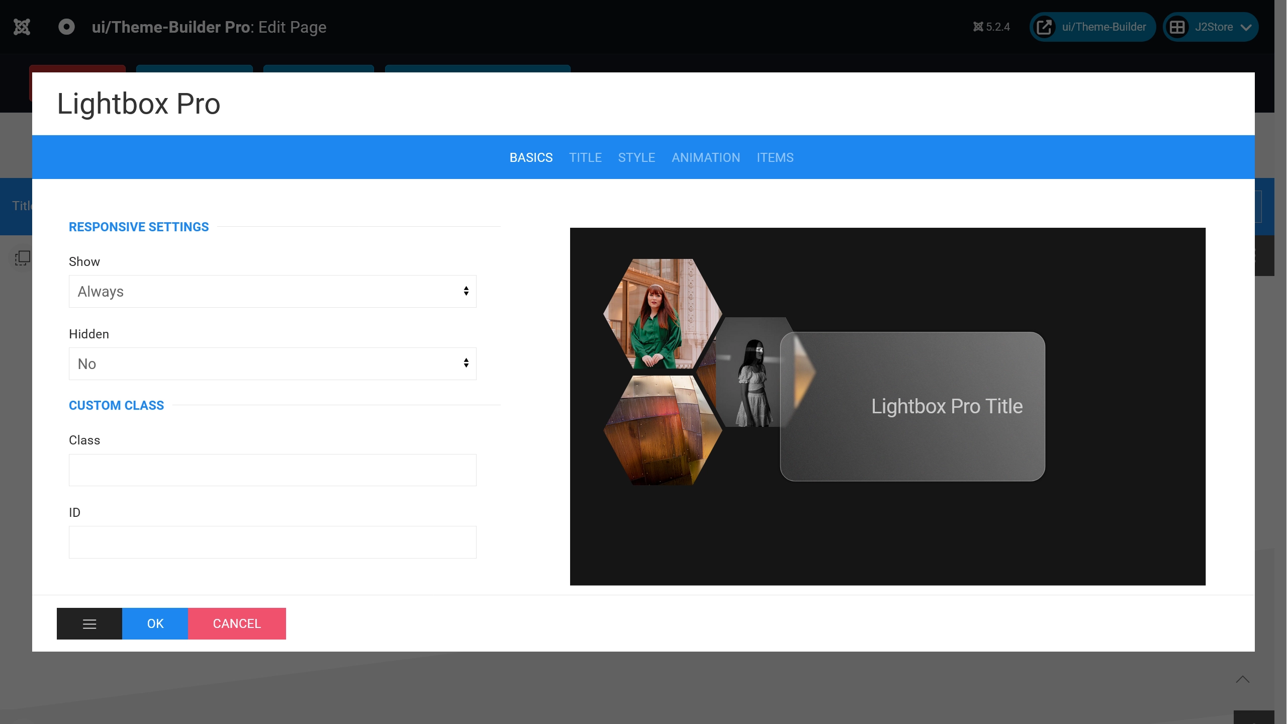
- Show
- Select one of the following options to show the element for screens larger than the specified width.
- Hidden
- Select one of the following options to hide the element from screens larger than a specified width.
- Class
- Define one or more class names for the element. Separate multiple classes with spaces.
- ID
- ID Selector for the element.
Title Settings
- Title Show
- When set to 'Yes', this option will enable component title in front-end.
- SVG Title?
- When set to 'Yes', this option will enable svg title in front-end with Glass effect. All settings for this can be found in the Style tab when the Hexagon layout is selected.
- Title
- Enter text which will be used as Component title.
- Title HTML Tag
- Choose a HTML-Tag for the title.
- Font Size
- Set Title font size for this selector.
- Font Weight
- Set Title font weight for this selector.
- Title Style
- Choose a title style modifier.
- Title Color
- Choose a Title color.
Style Settings
- Addon Padding
- Choose a padding for the component.
- Grid: Match height
- Yes or No.
- Tablet Grid Settings
- Select a Element Width for Tablets
- Desktop Grid Settings
- Select a Element Width for Desktop
- TV's Grid Settings
- Select a Element Width for TV's
- Grid Gutter
- The Grid component comes with a default gutter that is decreased automatically from a certain breakpoint usually on a smaller desktop viewport width.
- Layout
- Choose a Layout. (Hexagon and Thumbnail only 'Lightbox Pro' Component)
Note: Thumbnails have other setting options such as Button Layout or Hexagon-Layout. - Lightbox Animation
- By default, the Lightbox gallery uses a slide animation. You can set the animation option to use a different one.
- Autoplay
- Lightbox autoplays. (Delay in milliseconds, 0 - disable)
- Autoplay interval
- The delay between switching slides in autoplay mode. (0 - disable)
- Use Load More Script?
- Yes or No. Adding a 'Load More Button' to your content.
- Use Reset?
- Yes or No.
- Button Space
- Set the space between your content and the load more button.
- Button Type
- Set the type of the button.
- Button Size
- Choose a button size.
- Full Width?
- Set button width. Select 'Yes' to add full width to this button.
- Start Items?
- How many items should be displayed at the start.
- Add Items?
- How many items should be added.
Animation Settings
- Scrollspy Animation
- The Scrollspy component listens to page scrolling and triggers events based on the scroll position. For example, if you scroll down a page and an element appears in the viewport for the first time, you can trigger a smooth animation to fade in the element.
- Use Box Parallax Animation?
- Yes or No. (Learn more)
Items Settings
- Lightbox Image Items
- Add or remove lightbox items.
")