The video component represents a video or movie.
Basics Settings
- Date Publishing Settings
- Set the Start Publishing and Finish Publishing dates. This will cause the ui/Theme-Builder component to only be published for the specified time period. If you use both the Start Publishing and the Finish Publishing, the ui/Theme-Builder component will show up only between the beginning date and the ending date.
- Start Publishing
- If you only set the Start Publishing and not the Finish Publishing, Joomla! will begin displaying the ui/Theme-Builder component on the beginning publishing date given but it will never stop showing the component.
- Finish Publishing
- If you only set the Finish Publishing and not the Start Publishing, Joomla! will show the ui/Theme-Builder component as soon as you have turned it on and will stop showing the component once the ending publishing date has been reached.
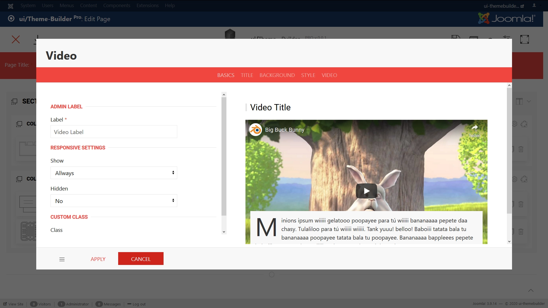
- Label
- Define a name to easily identify this element inside the Theme-Builder.
- Position
- Position the component in the normal content flow but with an offset relative to itself.
- Left
- If position: relative; - the left property sets the left edge of an element to a unit to the left/right of its normal position.
If position: absolute; - the left property sets the left edge of an element to a unit to the left of the left edge of its nearest positioned ancestor. (e.g. 20% or 50px ...) - Right
- If position: relative; - the right property sets the right edge of an element to a unit to the left/right of its normal position.
If position: absolute; - the right property sets the right edge of an element to a unit to the right of the right edge of its nearest positioned ancestor. (e.g. -20% or 50px ...) - Top
- If position: relative; - the top property makes the element's top edge to move above/below its normal position.
If position: absolute; - the top property sets the top edge of an element to a unit above/below the top edge of its nearest positioned ancestor. (e.g. -20% or 50px ...) - Bottom
- If position: relative; - the bottom property makes the element's bottom edge to move above/below its normal position.
If position: absolute; - the bottom property sets the bottom edge of an element to a unit above/below the bottom edge of its nearest positioned ancestor. (e.g. 10% or 50px ...) - z-index
- The z-index property specifies the stack order of an element. Z-index only works on positioned elements (position: absolute, position: relative).
- Show
- Select one of the following options to show the element for screens larger than the specified width.
- Hidden
- Select one of the following options to hide the element from screens larger than a specified width.
- Class
- Define one or more class names for the element. Separate multiple classes with spaces.
- ID
- ID Selector for the element.
Title Settings
- Title Show
- When set to 'Yes', this option will enable component title in front-end.
- Title
- Enter text which will be used as Component title.
- Title HTML Tag
- Choose a HTML-Tag for the title.
- Font Size
- Set Title font size for this selector.
- Font Weight
- Set Title font weight for this selector.
- Title Style
- Choose a title style modifier.
- Title Color
- Choose a Title color.
Background Settings
- Custom Background
- When set to 'Yes', you can set different background options. (Background images, different Blendmodes, Custom color)When set to 'SVG', you can use your own SVG backgrounds. (Learn more)
- Background
- Choose a default content overlay background color.
Style Settings
- Addon Padding
- Choose a padding for the component.
Video Settings
- Link
- Enter Video Link.
- Meta Thumbnail Image?
- Set an meta Thumbnail image.
- Viewport Height
- Yes or No.
- Video Height
- Set a video height.
- Content inner Padding
- Set overlay content inner padding.
- Content outher Padding
- Set overlay content outher padding.
- Overlay Position
- Set a position for the content
- Position Modifier
- To apply a margin to positioned elements choose one of the following options.
- Overlay
- Add one of these options to add a background color to the overlay.
- Content
- Enter text used as component content.
- Autoplay
- Yes or No.
- Show Controls?
- Yes or No.
- Show Info?
- Yes or No.
- Show Suggestions?
- Yes or No.
- Loop
- Yes or No.
- Video Muted?
- Yes or No.
- Start At
- Insert video start time in sec.
Animation Settings
- Scrollspy Animation
- The Scrollspy component listens to page scrolling and triggers events based on the scroll position. For example, if you scroll down a page and an element appears in the viewport for the first time, you can trigger a smooth animation to fade in the element.
- Responsive
- Add a number in pixel, e.g. 640, or a breakpoint, e.g. @s, @m, @l or @xl. The parallax will be shown for the specified viewport width and larger.
- Viewport position
- Using the viewport option you can adjust the animation duration. The value defines how far inside the viewport the target element is scrolled until the animation is completed. With the value 1 , the animation lasts as long as the element is in the viewport (default behavior). Setting it to 0.5, for example, animates the property until the scroll position reaches the middle of the target element.
- Use Box Parallax Animation?
- Yes or No. (Learn more)
- Background Image Parallax?
- Yes or No.
")